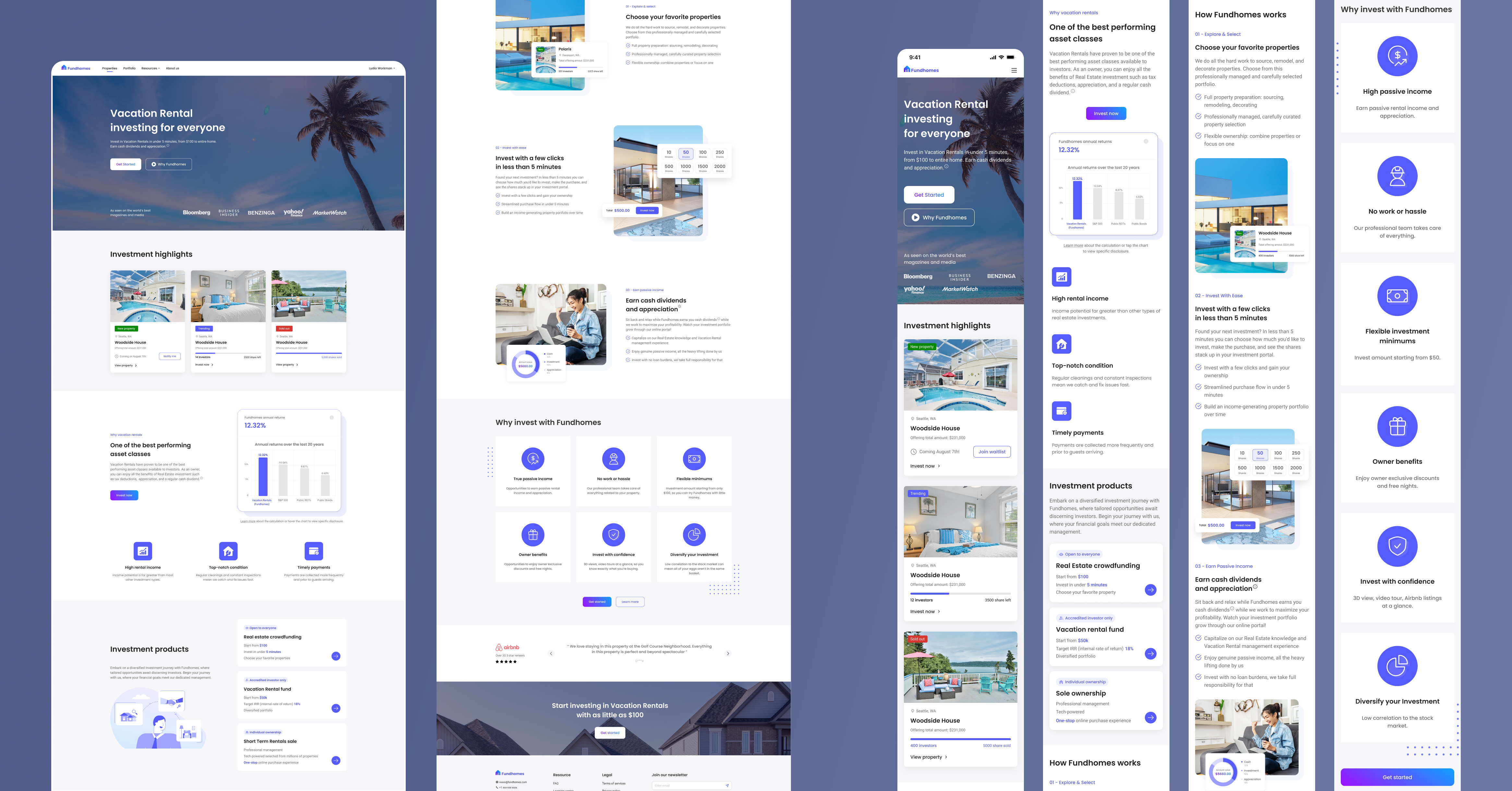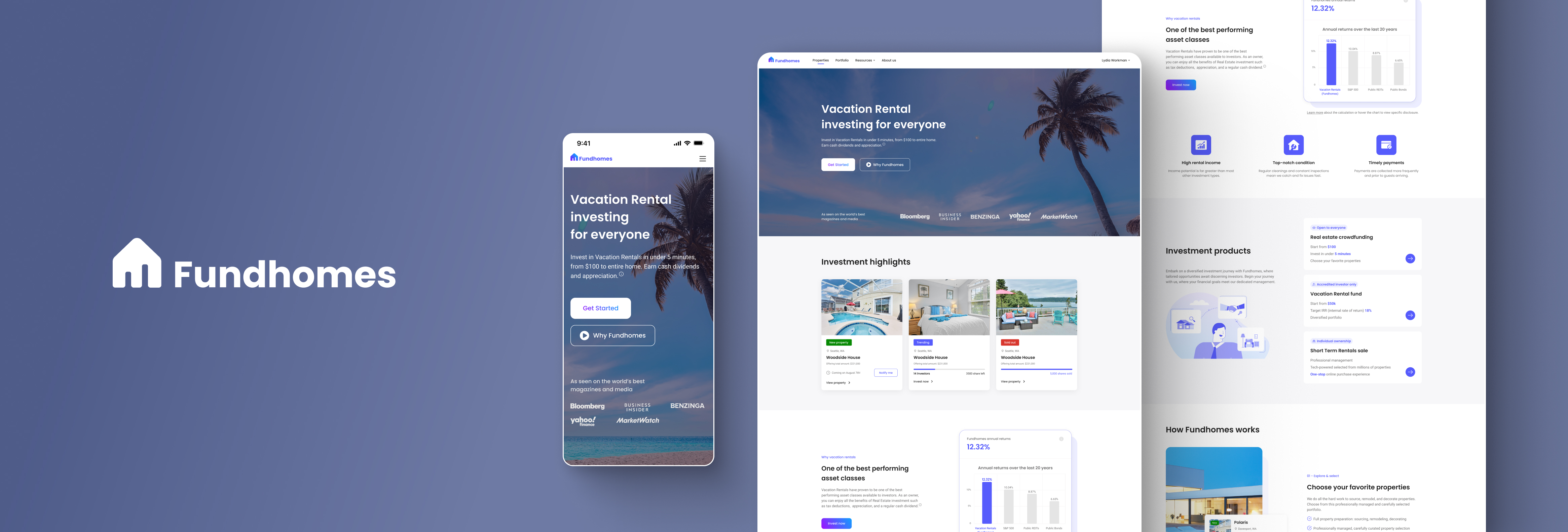
🔍 Overview
A responsive homepage redesign introducing intuitive investment product comparisons and guided entry points—improving user clarity and boosting product sales.
🧩 Challenges
1. User Confusion: Investors struggled to understand the differences between three product types.
1) Small-scale investment — buying fractional shares of vacation properties.
2) Mid-scale investment — co-owning a vacation property with a small group.
3) Large-scale investment — purchasing an entire vacation property individually.
2. Hidden Entry Point: The homepage did not highlight these options, forcing users to search through the navigation menu.
🎯 Goal
1. Drive Engagement: Help more clients discover and understand our investment offerings.
2. Boost Product Sales: Convert more visitors into investors
2. Boost Product Sales: Convert more visitors into investors
🛠️ Solutions
📈 Impact
1. +35% Click-Through Rate: Product detail page visits increased significantly.
2. -20% Development Time: Streamlined design reduced engineering effort.
3. Two Weeks Early Launch: New web went live ahead of schedule, accelerating go-to-market.
2. -20% Development Time: Streamlined design reduced engineering effort.
3. Two Weeks Early Launch: New web went live ahead of schedule, accelerating go-to-market.